
Case study · Vendor management · Food delivery in Paraguay

Vendor Tool:
manage your restaurant yourself

I designed the Monchis vendor dashboard end to end: menu, orders, franchise view and team roles. The goal was simple: a restaurant can change a price, hide a product or add a user without calling support.

Role
Sr Product Designer, end to end
Company
Monchis
Scope
Web dashboard, desktop first, adapted to mobile
Timeline
One quarter of design (Q1 2025), then continuous improvement
Launch
May 2025
Team
  • Lucia Giacomelli Product Manager
  • Fabian de la Cruz Engineering Manager
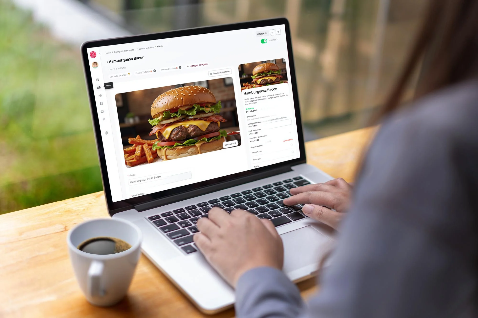
A person working on a laptop at a café table, with the Vendor Tool product editor open on Hamburguesa Bacon: the product photo, its fields and the live preview of the customer's card
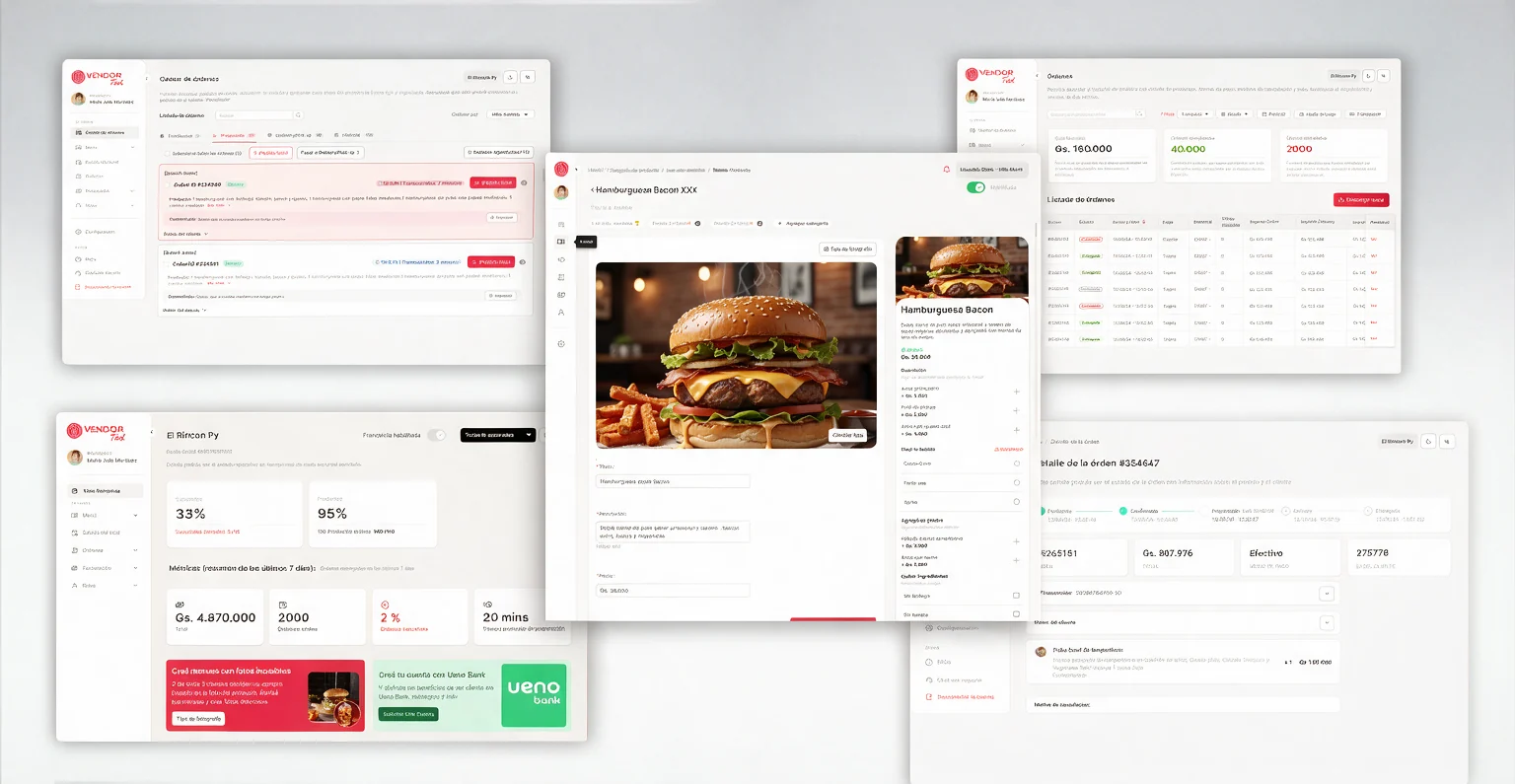
Five Vendor Tool screens laid out on a light grey surface: the order queue with pending orders, the orders list with its totals, the product editor for Hamburguesa Bacon XXX with its live preview, a branch dashboard with the last seven days of metrics, and an order detail

Vendors were running restaurants through phone calls and spreadsheets.

Monchis is a food delivery app in Paraguay. The restaurants that sell on it, the vendors, managed their menu and their orders through a vendor platform that had stopped keeping up.

It had two problems. Managing it took too much manual work, and it had an operating ceiling: every new branch added manual overhead instead of removing it.

What we set out to do

  • Self-managementVendors control their own menu, photos, prices, orders and team, without calling support for every change.
  • Data and AINarrow the quality gap between a professional vendor and an informal one, starting with photos and content.
  • Ecosystem growthMake the dashboard a growth channel, with touchpoints for financial services and photography tools, not only an admin panel.

What I designed

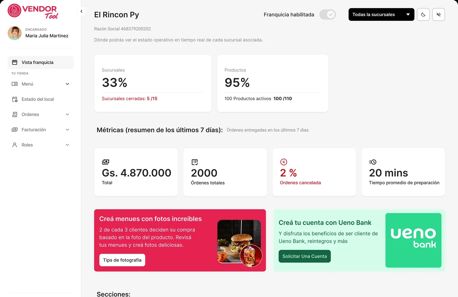
Franchise view

The operating status of every branch on one screen.

Menu and catalog

Categories, products, promos, add-ons and photos.

Orders

A live queue, order history and order detail.

Roles and permissions

Access scoped by franchise, branch and role.

For single-branch owners and for franchises with many branches.

What the operation told us

The evidence here is operational data, not vendor interviews. It was enough to show where the old platform broke, and each finding shaped one decision later in the case.

Two problems, seen in the operation

Fragmentation and latency (Q4)

POS was the fastest order-reception channel, at 0.9 min acceptance time, used by 41% of branches. Vendor Tool was used by the other 48%.

Service volatility (Q3)

Orders grew 15% through August, then fell 8% in September, and in that same month, Service Level dropped from 98% to 77%.

That set the brief: vendors needed stability, not just a tool.

Our previous vendor platform faced two main challenges: management friction and an operating ceiling.

545
Vendors
116.6k
Total orders
37k
Monchis users

The network at the time of the redesign.

From finding to design decision

  • Order acceptance split unevenly across channels, and Service Level was volatileThe queue has to make time visible and the decision fast. Next: the order queue.
  • Photo quality varied across 545 independent vendorsCoach the photo at upload, and review it before it goes live. Next: photo coaching.
  • Franchises had to delegate without losing controlAccess scoped by franchise and branch, with guarded destructive actions. Next: roles and access.

One dashboard for products, orders, status and team.

Vendor Tool covers the day-to-day of running a menu: products, photos, categories and promos, all edited and reviewed from the same place.

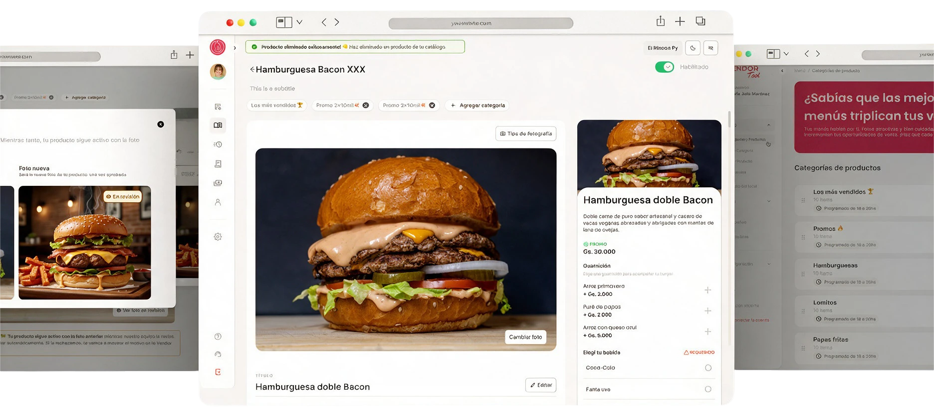
Three Vendor Tool screens: a photo waiting in review while the product stays live with its previous photo, the product editor for Hamburguesa Bacon XXX with its live preview, and the product-categories list
A photo in review while the product stays live, the product editor with its live preview, and the categories list.

Franchise-wide view

Real-time operating status across every branch, from a single screen.

Self-service menu and photos

Vendors edit their content and photos themselves, with photo tips and review built into the flow.

Role-based access

Franchise owners give each person access to specific branches, and nothing more.

A menu vendors can keep up to date on their own

Categories can be scheduled and switched on or off. Products carry promos and add-ons. Photos and copy are edited in the same place, with AI helping improve both, and the photo tips one tap away.

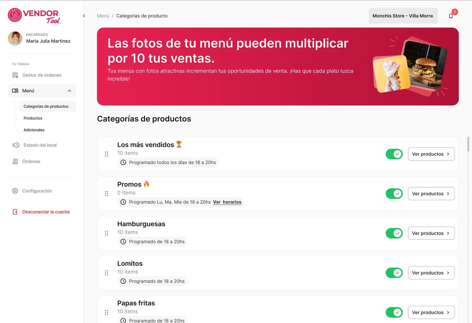
Product categories list: Los más vendidos, Promos, Hamburguesas, Lomitos and Papas fritas, each with a visibility schedule and an on/off switch, under a red banner about photos
Categories, each with a visibility schedule and an on/off switch.
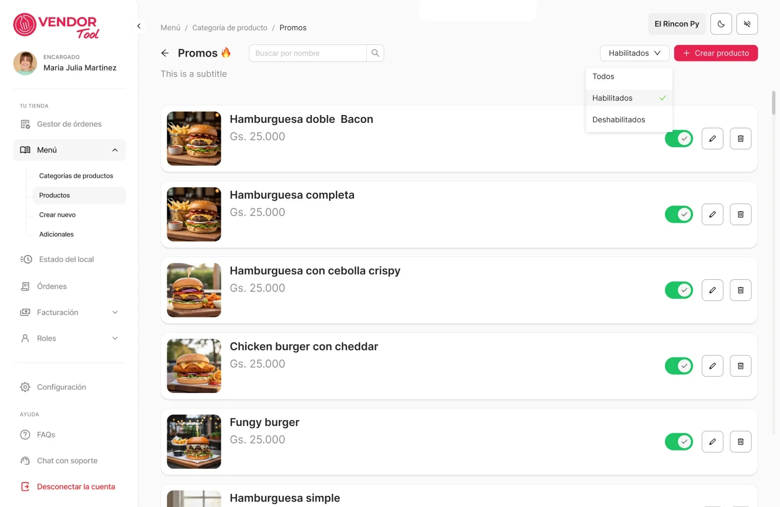
Product list inside the Promos category, with photo, name, price and an on/off switch for each burger
Inside a category (Promos): every product has its own switch.

An editor with a live preview

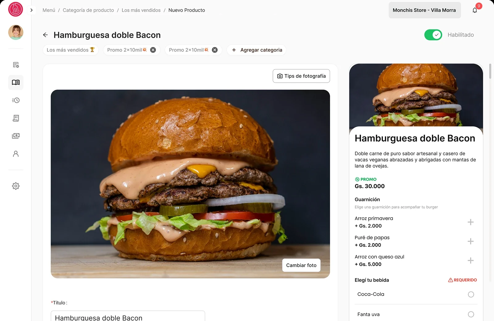
The product editor shows a live preview beside the form: the product as customers will see it in the app, with its promo, side dishes and required options. What the vendor changes is what the customer gets.

Product editor for Hamburguesa doble Bacon, with breadcrumb, an enabled switch, category chips, a large photo with a Tips de fotografía button and a Cambiar foto button, and a live preview of the customer's product card on the right
The editor on desktop, with the photo and a "Tips de fotografía" button, and the live preview on the right.
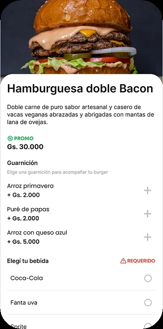
The customer's product card as shown in the live preview: name, description, promo price, side dishes and a required drink choice
The live preview up close: what the customer sees.
Green confirmation banner in Spanish after disabling a product
Switching a product off ends with a clear confirmation, and it says how to undo it. "Ya no se mostrará en el catálogo de tus productos. Si deseas volver a habilitarlo, sólo debes activar la opción." It will no longer appear in your catalog. To enable it again, just turn the option back on.

Three decisions that shaped the tool

Coach the photo where it gets uploaded

Monchis' own product copy tells vendors that 2 out of 3 customers decide based on the photo. Photos were also the hardest thing to keep consistent across 545 independent vendors.

So the help sits where the photo is. A "Tips de fotografía" button opens a short guide: framing and the rule of thirds, natural light, and colours and textures that make a dish look good.

Every new photo then goes to the Monchis team for review before customers see it. While it waits, the product stays live with the previous photo. If it is rejected, the vendor sees why and can try again. If it is approved, it goes live with nothing more for the vendor to do.
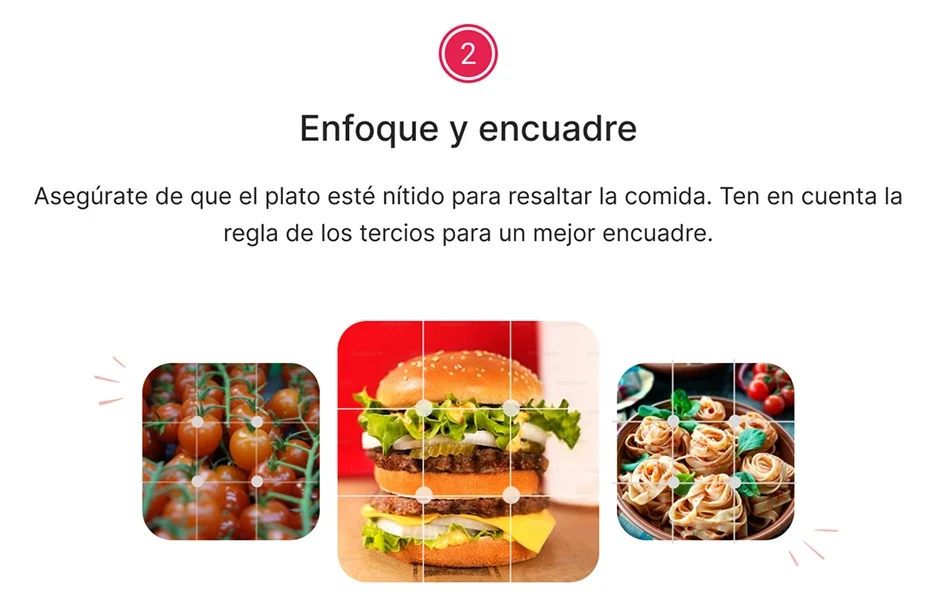
Photo guide, step 2, Enfoque y encuadre: a burger with a rule-of-thirds grid over it
Framing & composition
Keep the dish sharp and use the rule of thirds.
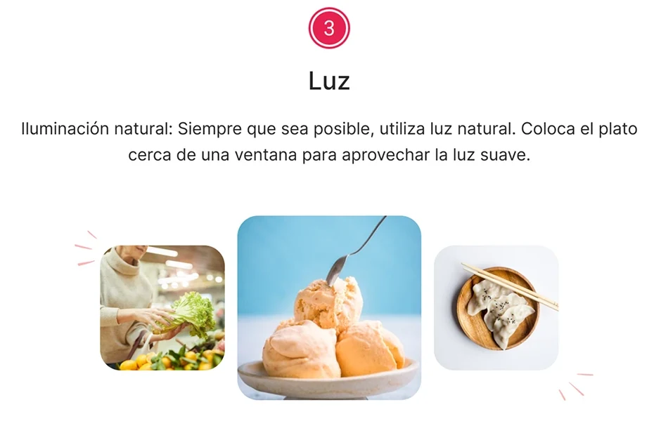
Photo guide, step 3, Luz: natural light instructions with a dessert photographed by a window
Natural lighting
Use natural light, and place the dish near a window.

Photo guide, step 4, Crea productos tentadores: vibrant colours and close-up texture
Tempting framing
Vibrant colours, and get close to show texture.
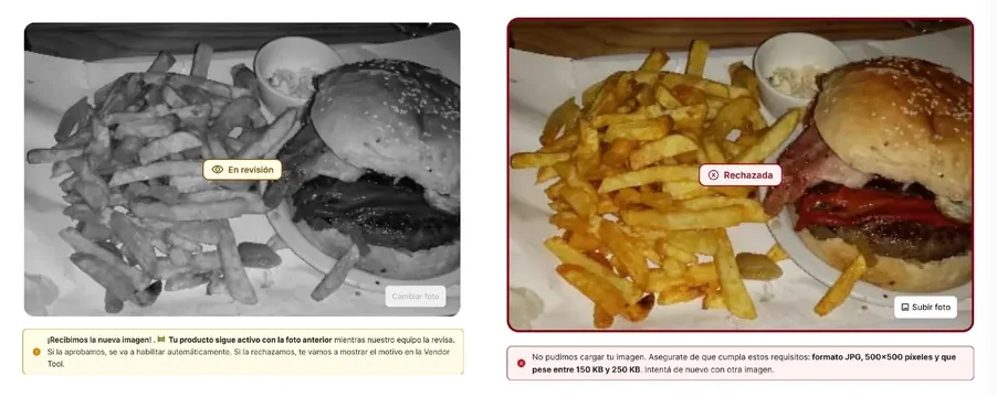
Two photo states. In review: a greyed photo with an In review tag and a note saying the product stays active with the previous photo. Rejected: a photo with a Rejected tag and a note listing the requirements, JPG, 500 by 500 pixels, between 150 and 250 KB.
Two of the three photo states. In review: the product stays active with the previous photo. Rejected: the note gives the requirements (JPG, 500×500 px, 150 to 250 KB) so the vendor can retry. Approved photos go live on their own.

Build the order queue around the clock

Slow acceptance was the pain, so the queue is built around time. Every pending order shows a countdown, and the card turns red as the clock runs down.

The whole order is on the card: products, add-ons, comments and payment method. A busy cashier doesn't have to open anything to decide. Accept and reject are one tap each, and selected orders move to "Preparando" together.

Two orders in "Preparando". Each card shows the time elapsed, and turns red once it runs past the limit: "Transcurridos: 7 minutos" Elapsed: 7 minutes.
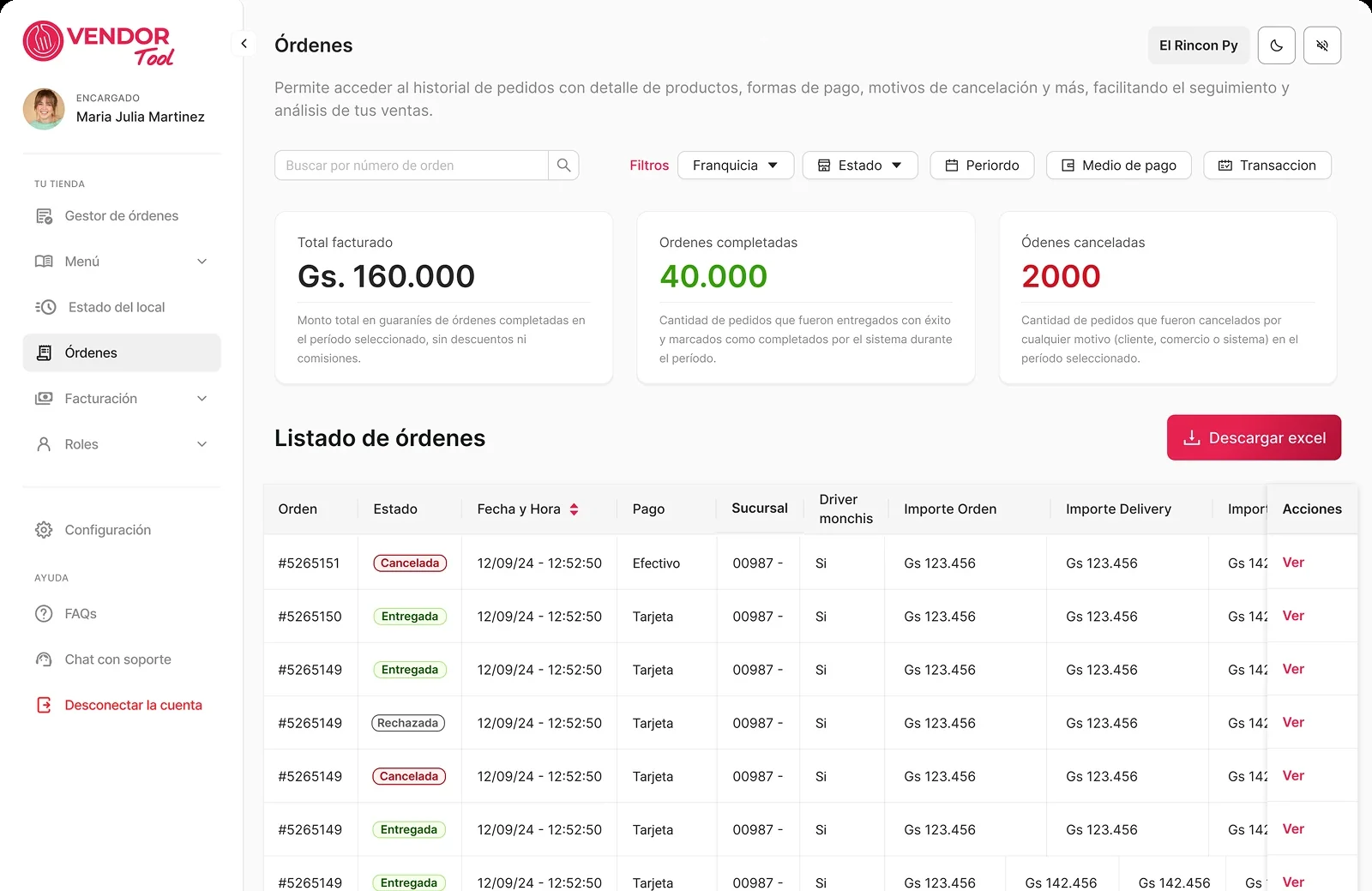
Order history with filters by franchise, status, period, payment method and transaction, three summary cards for billed total, completed orders and cancelled orders, and a table of orders with status pills
History, with filters, GMV for the period and a status on every order.
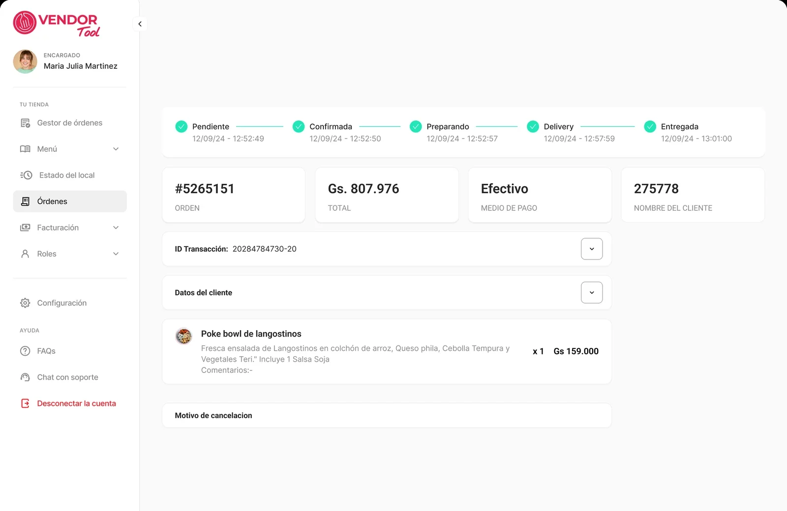
Order detail with a five-step timeline, Pendiente, Confirmada, Preparando, Delivery and Entregada, each with a time stamp, then order number, total, payment method and the products
Detail, with a five-step timeline and a time stamp for each step.

Give access per branch, and guard the destructive action

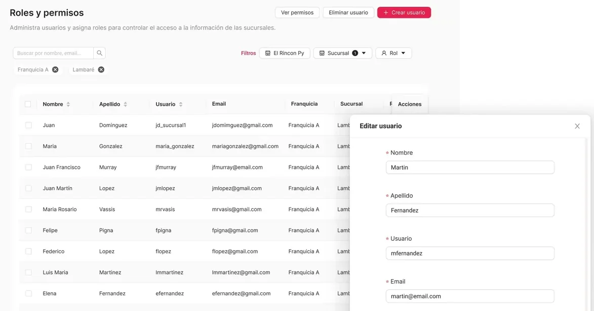
Franchises needed to hand daily work to other people without losing control. So access is scoped by franchise and branch, not a flat list of users. The roles table filters by franchise, branch and role, and owners create and edit users themselves, with no support ticket.

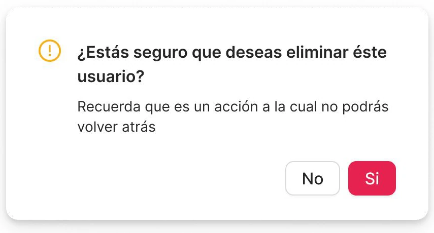
Removing a user can't be undone, so it asks for a second step: "¿Estás seguro que deseas eliminar este usuario? Recuerda que es un acción a la cual no podrás volver atrás." Are you sure you want to remove this user? This action can't be undone.

Roles y permisos screen: buttons to view permissions, remove a user and create a user, filters by franchise, branch and role, a table of users, and an Editar usuario panel open on the right
Roles and permissions: filter by franchise, branch and role, and edit a user in a panel. The roles are Operativo and Gerente.
Confirmation modal in Spanish: are you sure you want to delete this user, this action cannot be undone, with No and Sí buttons
The second step before removing a user.

See it move

The tool screen by screen: the franchise view, the menu and the editor, the order queue and the roles table.

What changed, and what I learned

72 h → 0
Manual hours spent on catalog changes, removed by the new self-service catalog.
−50%
Drop in "branch unavailable" status, the top reason vendors cancelled.
150+ h/mo
Support and catalog hours given back every month.

These are the actual final numbers, measured after I'd rolled off the project, not a projection. All three map to what I designed: the catalog editor replaced a support-ticket workflow, and the franchise view is what made branch status visible in the first place.

830 branches were unlocked (61% of GMV) through Vendor Tool's own billing module, which I also designed as part of the dashboard.

Where the migration landed

100%

Of the vendor base migrated onto the new system.

2 legacy systems

Deprecated in a single quarter.

2,000+ / month

Restaurants and businesses active monthly across Vendor Tool, the in-store POS, and a later check-in tool.

100% of the tools became measurable for the first time, via Amplitude. Before this, none of it was instrumented.

After launch

Migration and standardization

92% of franchises had moved onto the new system by this point, so branches that ran on very different tools were starting to work the same way. 103 Multicomercio franchises were still transitioning when I wrote this. By the time I left, migration reached 100%.

Toward self-service

I improved the UI, tooltips and FAQ/support integration, so vendors need to contact support less often.

What I learned

Self-management is the test for every screen

Each job that used to need a support call became something the vendor can do alone: change a price, hide a product, add a user. I checked every screen against that.

Photo quality is a growth lever, not a cosmetic one

If 2 in 3 customers decide on the photo, coaching it at upload and reviewing it before it goes live matters more than correcting it later.

Migration is a design problem too

Moving legacy franchises onto one system was as much a UX challenge as any new feature.

If I had more time

  • Measure what the case is about. Track acceptance time and support contacts per branch, before and after.
  • Test with the people in the queue. Run a usability session on the order queue with cashiers, during a real service.
  • Hold up as the network doubles. The target is to go from 545 to 1,080 vendors (+98%), so the queue, permissions and photo review have to keep working at twice the volume.

The system behind the tool

Buttons, switches, the category picker, the queue tabs and the side navigation: built once, and reused across orders, menu and team.

Legible statuses

Built for a queue, not a dashboard demo: a status has to read at a glance during a busy service.

Forgiving destructive actions

Anything that can't be undone asks for a second step. Switching a product off can be undone with one tap.

No guessing

Every state says what happens next, so the vendor is never left wondering.