Food delivery · Itti · Q3–Q4 2025
monchis
new home.
Company
🇵🇾 monchis
Role
Sr Product Designer (end-to-end)
Mandate
Open scope, asked to take the lead
Time
1 Quarter · Research · Design · Test
Scope
Discovery → Delivery · Oct 2025
Scale
61K users · 300K orders · 1,268 vendors
Context & problem
A home built for browsing,
for people who weren't browsing.
❌ Current home · before
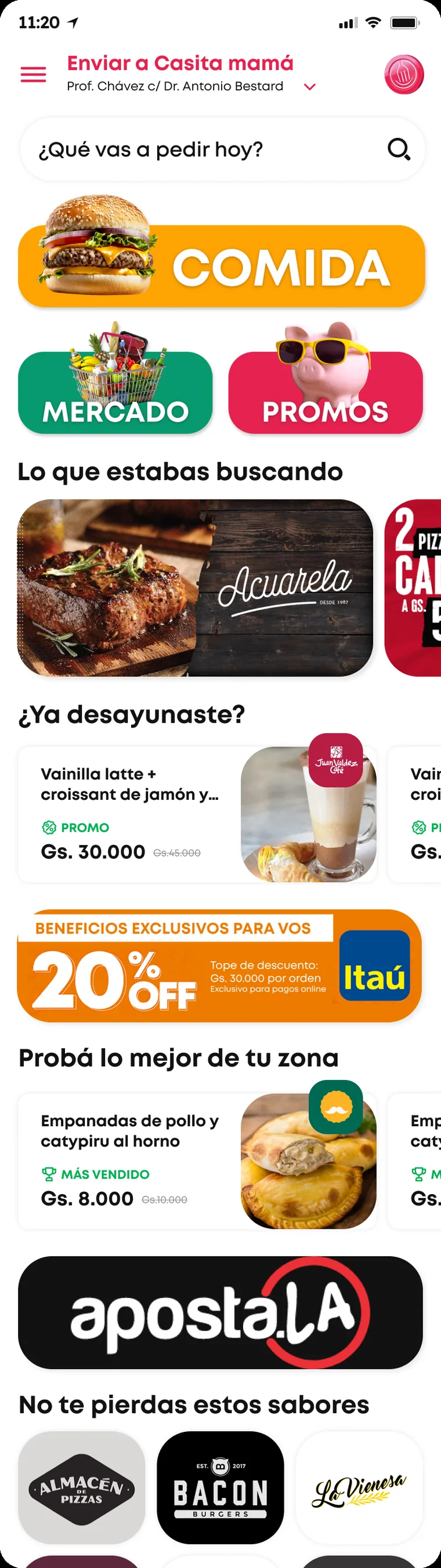
Old Monchis home, full scroll
Outdated · Disorganized
↓ and it kept
scrolling
The mandate
I wasn't handed a brief. I was asked to take the lead on the home.

61K users, 300K orders, 1,268 vendors, and a home everyone agreed was underperforming without agreeing on why. Open scope meant I owned the framing: research first, then two directions, then a defended decision. The output of this project isn't a screen. It's the argument that produced it.

Outdated & unattractive UI
Disorganized layout. Icons don't match their categories. A negative first impression that costs trust before the first tap.
Discoverability failure
Users can't quickly find products. Too much time searching → frustration → abandonment.
No reorder or personalization
Can't find favourite stores. Can't repeat the last purchase. The app feels generic to a user who orders the same lunch every week.
Content blind to context
The same promos at 8am and 8pm, for every user. Merchandising that ignores time, preference and location.
Research · Discovery
Nobody could say why
the home wasn't converting.

I was brought in without a defined scope: the home "worked", but nobody could explain why it wasn't converting. So instead of redesigning a screen, I started by defining the question the home actually had to answer: is this a place to show what monchis is, or a place to get to the next order fast? Everything that follows, including the two paths, comes from that tension.

Method 01
Behavioural data
Amplitude across 61K users and 300K orders. Where taps land, which verticals get entered, where sessions die.
Method 02
Active listening
User feedback and support inputs, coded into themes: discoverability, speed, personalization, promo visibility.
Method 03
Heuristic audit
Mapping what the old home declared as hierarchy vs. what it actually delivered above the fold.
Method 04
Marketplace benchmark
Regional delivery and marketplace patterns for header, search persistence and category legibility.
What the numbers said
60%
of users engage with search, on a static placeholder
Search was the front door, disguised as a form field
80%
go straight into Restaurants from home
Users arrive with intent, not curiosity
67%+
of category traffic is burgers & pizza
High intent, low browsing: they already decided
27%
of navbar taps go to cart, the highest of any tab
Cart is the real destination. Home is just a corridor
The pattern was consistent: people arrive knowing roughly what they want. The old home was built for browsing, for an audience that wasn't browsing.
What users said
Discoverability
It's very difficult to find the products I want; I have to click a lot.
Speed expectation
The app is very slow; I generally want to buy something to eat quickly.
Personalization gap
I always order the same thing for lunch, but I can't mark stores as favorites.
Context-awareness
I opened the app this morning and saw beer offers. The app doesn't know what time it is.
Promo visibility
Shipping costs are high and it's very difficult to find stores with promotions.
Multi-store
I'm with my friends and I want to shop at different stores, but I can't.
Findings · What the research forced
Five findings,
and the constraint each one set.

I only kept findings that changed a decision. Each one is paired with the constraint it imposed on any design direction, which is exactly what made two paths possible instead of one.

Wireframes · Exploration
The arguments were settled
in low fidelity.

Low fidelity was where the real arguments got settled: block order, how many verticals survive above the fold, where the personalization slot lives, and what happens to the header on scroll. It's also where the sharpest idea of the project appeared, a contextual box driven by the moment of the day, and where I worked out the two things that make an idea like that survivable: how much space it's allowed to take from commercial content, and what happens when the user dismisses it. Carrying those unresolved trade-offs into review is what made two complete paths necessary instead of one polished opinion.

What the wireframes resolved
Search as primary entry point, not a field
One component, four moments, instead of four sections
Banner placement matched to onboarding prefs
Search sheet and box share one context engine
A day with Monchis: one box, four moments The same person across one day, with the sun moving from sunrise to night above her. At 8:40, with a coffee, she thinks "Something to start the day…" and her phone shows the box "¿Qué te tienta esta mañana?" with desayunos, café and 2x1. At 12:30, at her laptop, she thinks "I skipped lunch again" and the box reads "¿No almorzaste aún?" with quick options and menú del día. At 17:10, next to a slice of cake, she thinks "I need something sweet" and the box reads "Merienda con algo dulce" with cafeterías, postres and helados. At 21:00, by a window with the moon, she thinks "Not cooking tonight" and the box reads "Cena sin vueltas" with pizza, hamburguesas and mercado 24h. Labels at the bottom: for her, the right craving without searching; one box, four moments a day; for Monchis, four chances a day to convert. Something to start the day… I skipped lunch again. I need something sweet. Not cooking tonight. MAÑANA · 8:40 MEDIODÍA · 12:30 TARDE · 17:10 NOCHE · 21:00 ¿Qué te tienta esta mañana? ¿No almorzaste aún? Merienda con algo dulce Cena sin vueltas desayunos · café · 2x1 opciones rápidas · menú del día cafeterías · postres · helados pizza · hamburguesas · mercado 24h YOU: THE RIGHT CRAVING, NO SEARCHING ONE BOX. FOUR MOMENTS A DAY. MONCHIS: FOUR CHANCES TO CONVERT A day with Monchis: one box, four moments The same person at four moments of one day, each next to the Monchis box it gets. At 8:40, with a coffee: "Something to start the day…" and "¿Qué te tienta esta mañana?". At 12:30, at her laptop: "I skipped lunch again" and "¿No almorzaste aún?". At 17:10, next to a slice of cake: "I need something sweet" and "Merienda con algo dulce". At 21:00, by a window with the moon: "Not cooking tonight" and "Cena sin vueltas". Labels: for her, the right craving without searching; for Monchis, four chances to convert; one box, four moments a day. Something to start the day… MAÑANA · 8:40 ¿Qué te tienta esta mañana? desayunos · café · 2x1 I skipped lunch again. MEDIODÍA · 12:30 ¿No almorzaste aún? opciones rápidas · menú del día I need something sweet. TARDE · 17:10 Merienda con algo dulce cafeterías · postres · helados Not cooking tonight. NOCHE · 21:00 Cena sin vueltas pizza · hamburguesas · mercado 24h YOU: THE RIGHT CRAVING, NO SEARCHING MONCHIS: FOUR CHANCES TO CONVERT ONE BOX. FOUR MOMENTS A DAY.
The same box across one day. For the person, the right craving shows up without searching. For Monchis, every moment of the day is a new chance to turn a craving into an order.
The exploration · Time-of-day box
Where the box lives: after the user, before the catalogue
Greeting and favourites open the page, the offer banner and category row follow, and only then the contextual box: "¿Qué te tienta esta mañana?" with two stacked rails: an intent shortcut ("¿Fan de los desayunos?" · medialunas, café, tostados) and "Más favoriteados a esta hora". Commercial sections keep running underneath.
Rule
The box is dismissible, and if it's closed, it returns the next day with a different moment. Personalization that can't be refused stops being a service and becomes a banner.
The two paths · V1 vs V2
Two directions:
brand-led and task-led.

The findings pointed clearly at what the home had to do, but not at how much brand we were willing to trade for speed. Rather than pick for the business, I built both answers to the same brief, each internally consistent down to error and loading states. It moved the review from "I like this one" to "which cost are we choosing".

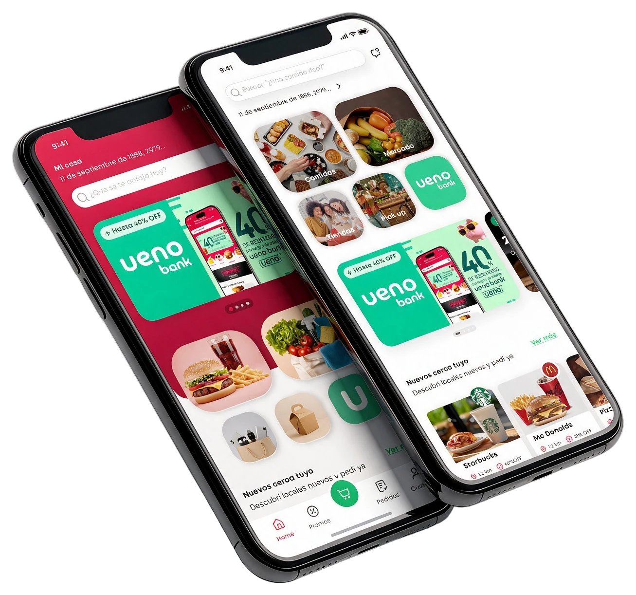
The two directions side by side on tilted phones: V1 on the left with a red brand header, address, search and a promo carousel over an image mosaic; V2 on the right with a neutral surface, search at the top and labeled vertical cards for Comidas, Mercado, Tiendas, Pick up and ueno
V1 · Brand-ledV2 · Task-led
Path V1 · Brand-led
The home as
a statement.
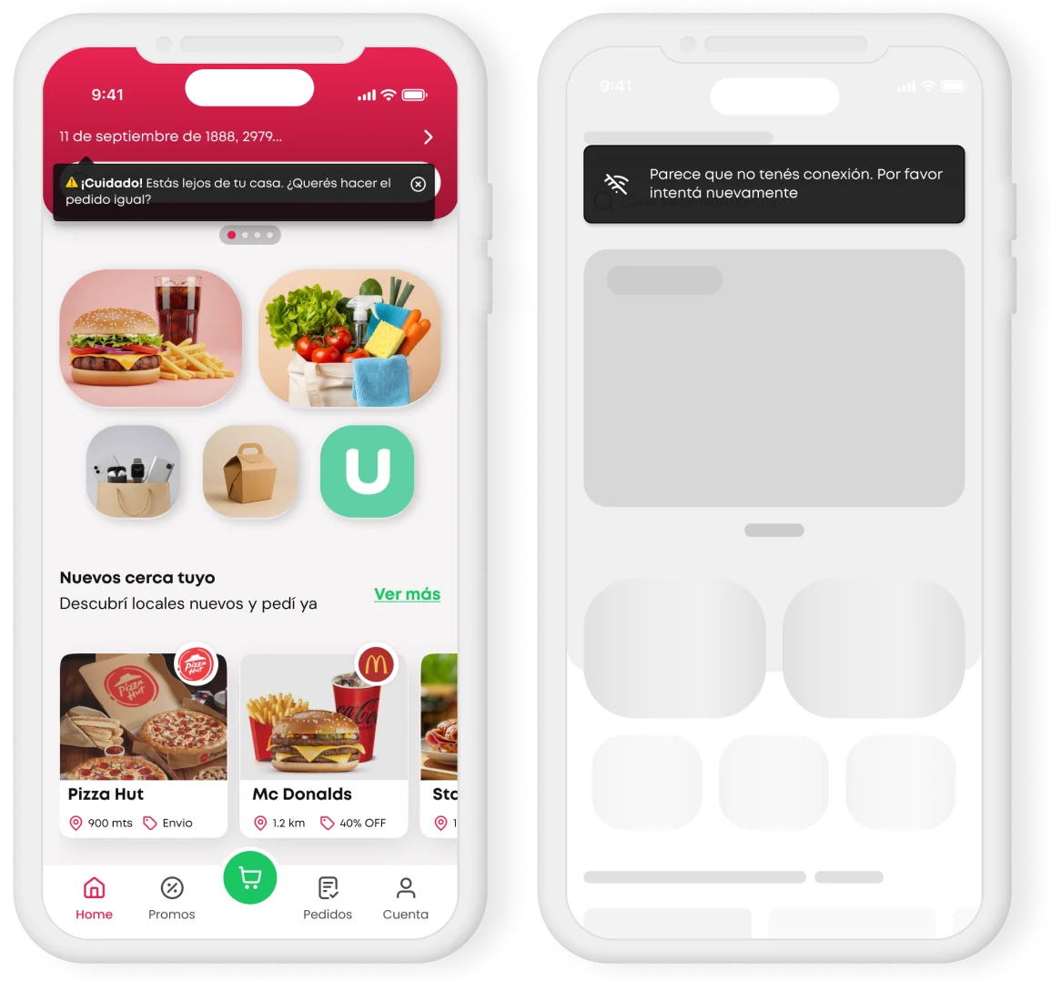
An extended red header owns the entry: saved address, greeting and search all live inside the brand block. Promo carousel takes the hero slot, verticals follow as an image mosaic.
Where it wins
✓ Address is impossible to miss: lowest risk of ordering to the wrong place
✓ The proximity alert ("estás lejos de tu casa") has a natural home inside the header
✓ Strongest brand recall on first frame
Where it costs
✕ The red block eats the first screen: verticals get pushed below the fold
✕ Search inherits the visual weight of the header and competes with the promo
✕ Unlabeled category mosaic leaves finding F05 unresolved
Path V2 · Task-led
The home as
a shortcut.
Neutral surface. Search is the first thing on screen, address one level below it. Labeled vertical cards move up; the promo becomes a module instead of the doorway.
Where it wins
✓ Search, address and all five verticals fit above the fold
✓ Photo + label kills the guessing game: Comidas, Mercado, Tiendas, Pick up, ueno
✓ Scales: a sixth vertical doesn't break the layout
Where it costs
✕ Much quieter brand presence on the first frame
✕ Promo loses the hero slot, and needed a separate conversation with commercial
✕ The proximity alert loses its container and has to be re-solved
V1 · Contextual alert & states
The red header earned its space by preventing an expensive error.

Ordering to the wrong address costs money, time and trust, so in V1 location isn't just displayed, it warns: "¡Cuidado! Estás lejos de tu casa. ¿Querés hacer el pedido igual?", dismissible and never blocking. The same pass covered the states nobody designs: skeleton loading on the real grid, and a persistent offline snackbar.

· Proximity alert docked inside the header block
· Dismissible with an explicit "order anyway" path
· Skeleton mirrors the final layout, no content jump
· Offline snackbar over the header, never blocking nav
V1: proximity alert and offline / loading states
V2 · Scroll behaviour & states
The header had to survive the scroll.

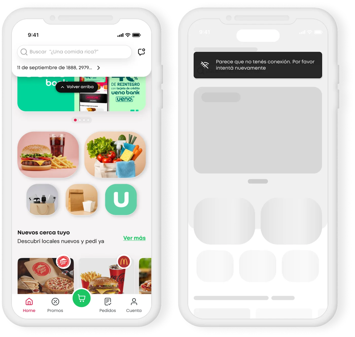
Putting search at the top only works if it stays there. In V2 the header collapses into a compact sticky bar (search plus abbreviated address) and a floating "Volver arriba" returns the full context without manual scrolling. What V2 had to solve separately was the alert: without a red block to dock into, the proximity warning becomes a contextual snackbar.

· Collapsed sticky header: search never leaves the screen
· Back-to-top after deep scroll
· Address abbreviated, never dropped
· Same skeleton and offline rules as V1: states are shared, not per-path
V2 scrolled state and offline state
How I decided
Criterion, tied to a finding V1 · Brand-led V2 · Task-led
Time to first action (F02)High: verticals below the foldLow: everything above the fold
Search persistence (F01)Scrolls away with the headerSticky, collapses but stays
Vertical legibility (F05)Image only, requires decodingPhoto + label
Room for personalization (F04)Competes with hero promoDedicated high slot
Address error preventionHighest: address is the headlineNeeds a dedicated pattern
Brand presenceHighMedium, carried by the system
Category scalabilityLimitedHigh
The call
V2 won on four of the five findings. V1 won on the one that costs real money.
So the final home isn't V2. It's V2's spine with V1's safeguards grafted on. Task-first structure, labeled verticals and the sticky search from V2; the contextual proximity alert and the address prominence from V1, re-expressed as a contextual snackbar instead of a permanent red block. The promo kept its reach by moving from doorway to module, which is the trade the commercial team ultimately signed off on.
The final version
What actually
shipped.

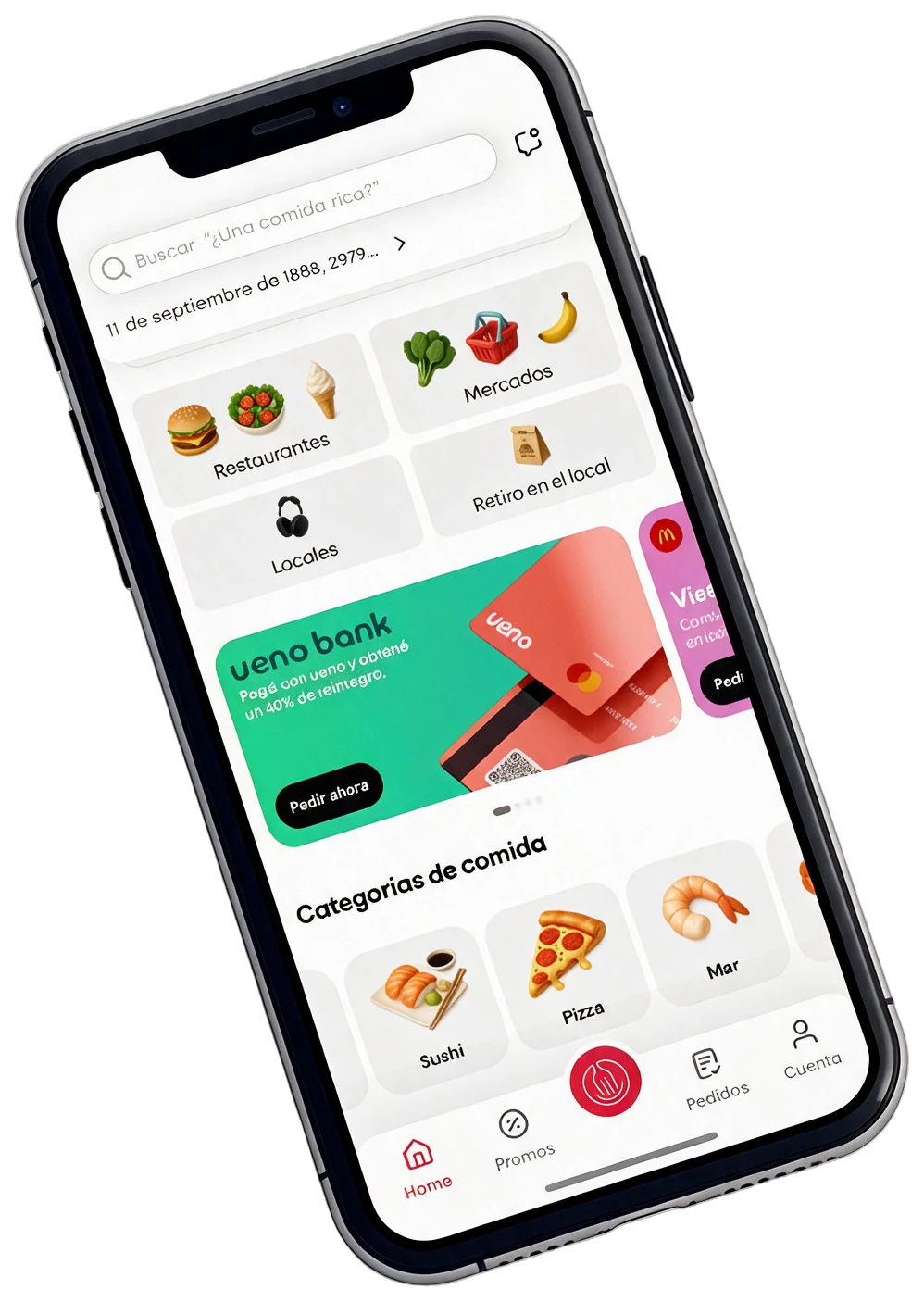
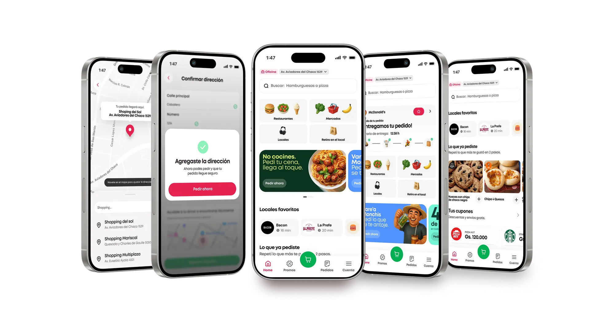
V2's structure survived contact with delivery, and the personalization layer the wireframes had been arguing for finally landed on top of it: favourite places, time-aware carousels, and a search bar that stopped being a field and started being a conversation.

Task-first spine · from V2
Search on top, labeled verticals above the fold, promo as a module. The sticky collapsing header carries search through the whole page.
Contextual safeguards · from V1
Proximity alert and address confirmation preserved, re-expressed as contextual snackbars rather than a permanent brand block.
The personalization layer · new
Favourite places, reorder and time-aware sections. This is the piece that later produced the highest CVR of any carousel on the page.
Final Monchis home on a tilted phone: search at the top with the saved address below, labeled verticals for Restaurantes, Mercados, Locales and Retiro en el local, a ueno bank promo module, food categories, and the bottom tab bar
Final · V2 spine + V1 safeguards
Feature focus · Animated dynamic search

Both paths agreed on one thing and disagreed on everything else: search had to lead. V2 won the structure argument, but this is the component that made the decision worth making: once search is permanently on screen, it stops being a field you fill and becomes the surface that carries context.

The search
that thinks.

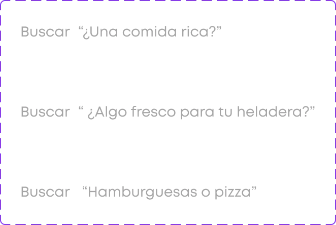
The animated search bar is the emotional centerpiece of the new home. Instead of a static placeholder, it rotates contextual suggestions based on time of day, user history, and active promotions, making the app feel alive, personal, and aware.

Time-aware: "¿Ya desayunaste?" at 9am · "Para el almuerzo" at noon · "¿Qué cenamos?" at 7pm
Preference-matched: reflects onboarding choices: "Mirá el sushi con delivery gratis"
Promotion-aware: surfaces active deals: "Hamburguesas al 50% OFF hoy"
60% of users click the search: 23.2K unique users · 90.1K clicks (Amplitude, Nov 2025)
9:41
▪▪▪▪ WiFi ▪▪
11 de septiembre de 1888, 2979... ›
🍔🥗🍦
Restaurantes
🥦🛒🍌
Mercados
🎧
Locales
🏪
Retiro en local
ueno bank
Pagá con ueno y obtené
un 40% de reintegro.
Locales favoritos
Chuchos
25 min
McDonald's
40 min
Subway
16 min
Burger King
25 min
🏠
Home
🏷
Promos
🛒
📋
Pedidos
👤
Cuenta
Time-aware · 9am
Rotates every 2.5s
60% click rate
🌅
Morning
"¿Ya desayunaste?"
☀️
Lunch
"Hamburguesas o pizza"
🌆
Afternoon
"¿Algo fresco?"
🎯
Preference
"Sushi con delivery gratis"
🏷
Promo
"Pizzas al 50% OFF"
Design system · Home components
★ Hero component

The search that thinks.

The animated search bar is the emotional centerpiece of the new home. Instead of a static "¿Qué vas a pedir?" it rotates contextual suggestions based on time of day, user preferences and active promotions, making the app feel alive and personal.

Time-aware: "¿Ya desayunaste?" at 9am, "¿Algo para cenar?" at night
Preference-matched: reflects onboarding choices: "Sushi con delivery gratis"
Promotion-aware: surfaces active deals: "Hamburguesas al 50% OFF"
60% of users click the search: 23.2K unique · 90.1K clicks (Amplitude)
Buscar
"¿Una comida rica?" "Hamburguesas o pizza" "¿Algo fresco?" "¿Ya desayunaste?" "Sushi con delivery gratis" "Pizzas al 50% OFF"
↑ Live demo · rotating every 2.5s
Search input · Static state
Search input
Dynamic placeholder · Variations
Search words
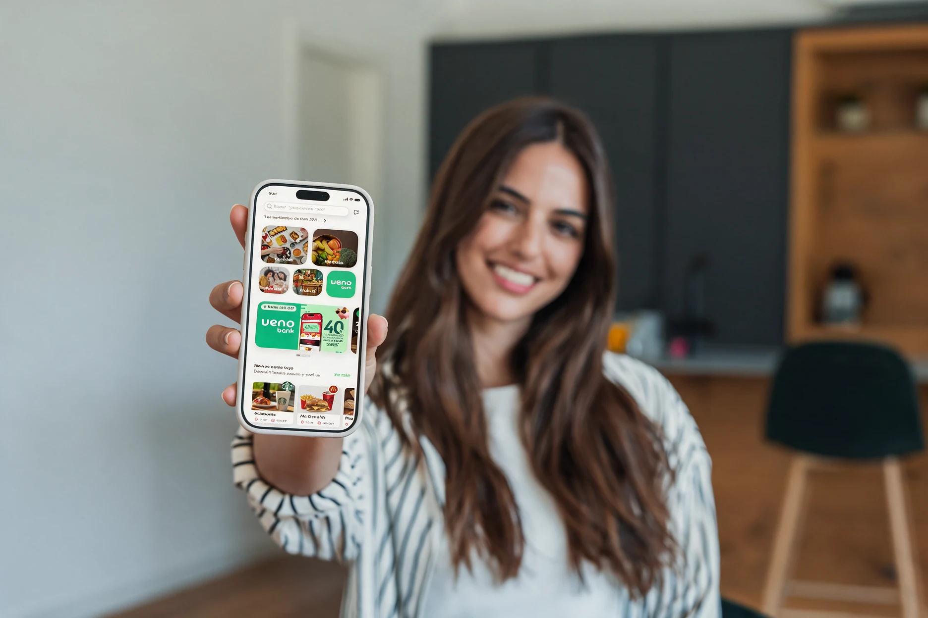
A smiling woman at home holds a phone toward the camera showing the new Monchis home: search at the top, labeled verticals, the ueno bank promo and food categories
Full flow · End-to-end experience
From address to
checkout, in one flow.
Full app flow
Impact & metrics · Amplitude Nov 2025
What Amplitude showed
in November 2025.
44.6%
CVR · Killer feature: customization (Favorite Places)
60%
Users interested in search · 23.2K unique · 90.1K clicks
80%
Users enter Restaurants vertical from home
77.8%
Complete the onboarding flow
67%+
Hamburgers & pizzas dominate food categories traffic
60%
Checkout completion rate
99.1%
Address loading success rate (1'29'' load time)
90%
Users prefer to search by map location
Carousel CVR breakdown
Favorite Places
44.6%
Pick up without delays
16.0%
New places near you
15.4%
Ready for Burgers?
15.0%
Pizza Craving
10.5%
27%
Shopping cart
25%
Home
16%
Account
12%
Orders
Key design decisions

The seven decisions
behind it.

  1. 01
    Two paths, not one proposal

    V1 and V2 turned a taste debate into an explicit trade-off.

    Process
  2. 02
    Animated dynamic search

    A static placeholder became rotating, contextual suggestions.

    60% click it
  3. 03
    Time-aware carousels

    No more beer promos at 8 am. Content follows the moment of the day.

    Trust
  4. 04
    Favourite places as the hero

    The best-performing carousel on the page, by far.

    44.6% CVR
  5. 05
    Personalized promo banners

    Three types: top locals, onboarding match, payment incentive.

    Relevance
  6. 06
    Facelift first, features later

    Ship the visual upgrade fast, then let data decide what to build.

    Speed
  7. 07
    A reusable component system

    Documented components cut QA cycles for the next iterations.

    Scale
The result

Personalization was the killer feature. Users convert when the product feels like it knows them.

What I'm taking to the next project
01
Show the trade-off, not an opinion.

Two fully resolved directions made the decision about cost, not taste.

02
Context is trust.

Knowing the time and the user changed how people felt about the app, and the numbers followed.

03
Documentation ships features.

A real system is a product investment: less QA, faster iterations.