


Case study · Passenger app · Ride-hailing in Paraguay

muv:
an easier way to get a ride

I designed muv's passenger app end to end, from survey and funnel analysis to a launched app. Onboarding went from 21 steps to 6, and the ride flow now says what is happening at every state.

Role
Sr Product Designer: research, UX, UI, design system, dev QA
Team
Passengers: Nathalia Torres (PM), Gabriel Vargas (Engineering Manager), data
Company
muv
Timeline
One quarter: research, design, test
Launch
May 2026, iOS and Android

People liked muv once they were in the car. Getting there was the problem.

muv is a Paraguayan ride-hailing marketplace. Riders place it between Uber, the safe and established option, and Bolt, the cheap one: muv is the good service, with a fair price for the quality, good drivers and a car that is easy to spot.

The business was growing fast on the legacy app, from 1,000 to 6,000+ drivers and from 2,000 to 39,000 passengers since 2024. But in a June 2025 survey, overall satisfaction came out at 5.99 out of 10: neutral, with nothing that builds loyalty.

Where the survey said it hurt

% of respondents

  • Say waiting-time estimates aren't accurate67%
  • Say the cars shown as available aren't accurate60%
  • Disagree that booking a car is fast50%
  • Disagree that the car's location is reliable46%
  • Find searching and booking a car difficult39%
  • Find the map and the route hard to see31%

Survey, June 2025, about 120 to 150 answers per question. The sample was mostly customers of B2B brands, so it leans towards corporate users.

Most of this was technical and about driver availability, not about the interface. Design couldn't make an ETA accurate, but it could stop leaving people guessing.

That became the brief: make every state of a ride explicit, predictable and trustworthy.

"The app says 1 minute and it's really 10 or more."

Survey respondent, June 2025

"Good fares, but nobody ever accepts your ride."

Survey respondent, June 2025

"In Asunción very few drivers accept trips. In Encarnación I always get good service."

Survey respondent, June 2025

Two sources, two problems

The survey

Registering and logging in were rated easy. The trouble was using the app: finding, booking and following a car.

The funnel

Onboarding had 21 steps, and only 25% of the people who started it finished it.

The survey only reached people who had already made it in, so it couldn't see the drop-off. The funnel could. Onboarding had to bring more people in, and the ride flow had to keep them.

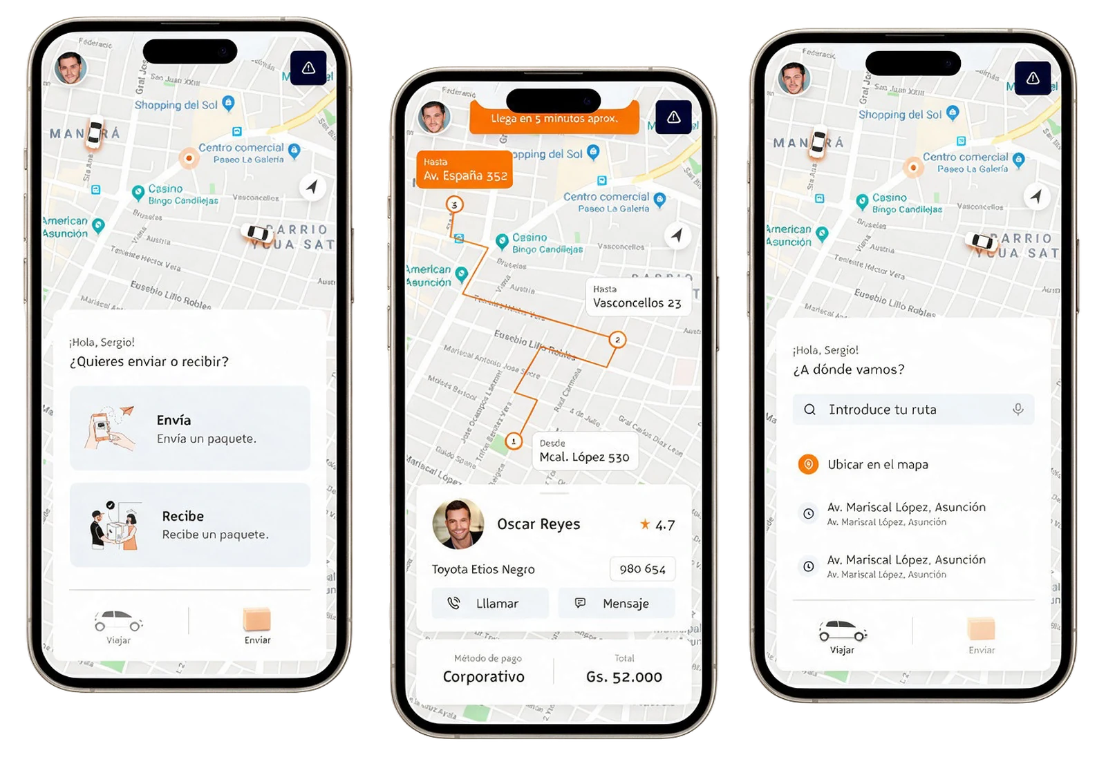
The legacy muv app in three screens: a chooser asking whether to send or receive a package, a trip in progress with a numbered multi-stop route, an arrival banner and the driver card with call and message buttons, and a home asking where to go with a route search field and recent addresses
The legacy app: a home built around a route search field and recent addresses, a send or receive chooser, and a trip view with numbered stops, the driver card and the payment method.

What we set out to do

  • Get to a first successful ride faster.
  • Make ride states explicit and predictable, with real-time feedback people can trust.
  • Keep the UI aligned with the backend states, so the screen says what is actually happening.
  • Show promotions across the interface.
  • Build a reusable system for future features.

What I redesigned

Onboarding

Includes the Unid integration and the value proposition, with a basic profile setup.

Home and navigation

A hybrid navigation model.

Trip and send

Requesting a ride, and sending or receiving packages.

Reviews

A new section to gather feedback and improve the product.

Secondary flows: account, favorites, payment methods, my trips and promotions.

Designing the ride as a set of states

A ride is a real-time system, so what the passenger sees has to match what the backend is doing. Before opening Figma I mapped the whole journey as five states, and wrote what the passenger should read in each one.

What you see is what's happening A passenger waits on the sidewalk looking at her phone, thinking "OK, it's finding me a driver". Her screen, shown large, reads "Waiting for the driver to confirm…" with a free-cancellation countdown. A dashed arrow carries the request to a driver in a muv car, who sees a new-trip card, and a second arrow brings the status back to her screen. The label in the middle reads: what you see equals what's happening. OK, it's finding me a driver. Waiting for the driver to confirm… 4:32 · free cancellation 9:41 New trip 1.2 km away request live status PASSENGER: CALM, INFORMED WHAT YOU SEE = WHAT'S HAPPENING DRIVER: DECIDING, 5 MIN What you see is what's happening A passenger waits on the sidewalk thinking "OK, it's finding me a driver". Below, her screen reads "Waiting for the driver to confirm…" with a free-cancellation countdown. Below that, a driver in a muv car sees a new-trip card. An orange arrow carries the request down to the driver and a navy arrow brings the live status back up to her screen. The closing label reads: what you see equals what's happening. OK, it's finding me a driver. Waiting for the driver to confirm… 4:32 · free cancellation 9:41 New trip 1.2 km away request live status PASSENGER: CALM, INFORMED DRIVER: DECIDING, 5 MIN WHAT YOU SEE = WHAT'S HAPPENING
The principle behind the five states: the screen only says what the system is actually doing, on both sides of the request.
  1. Request initiated

    Route on the map. A skeleton loader shows while availability is calculated.

  2. Matching in progress

    A five-minute free-cancellation countdown runs while the driver decides.

    "Waiting for the driver to confirm…"
    "Widening the search radius"
  3. Driver assigned

    "Driver confirmed ✨ · Juan is on his way · ACG 546TY"
  4. Ride in progress

    "Juan started your trip · 10 min to arrive"
  5. Ride completed

    Review with preset comments and trip characteristics.

Home: photo or map?

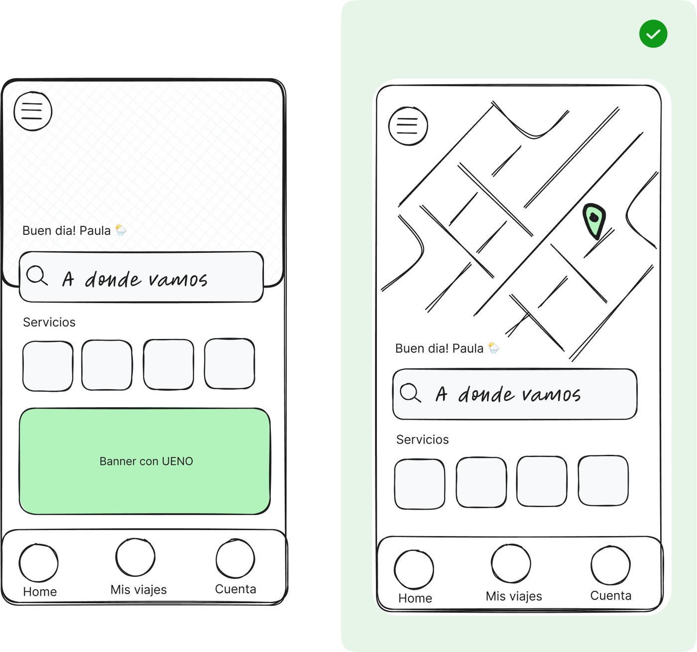
I put two low-fidelity homes in front of users: a photo header, and a live map. The map won.

It wasn't about looks. People think about a ride spatially: where am I, where is the car. So the map became the home, and the services sit in a sheet over it.

Two low-fidelity home screens side by side: a photo header (Photo) and a map header (Map), with the map option marked as the winner
Photo header vs map header. The map option is the one we kept.

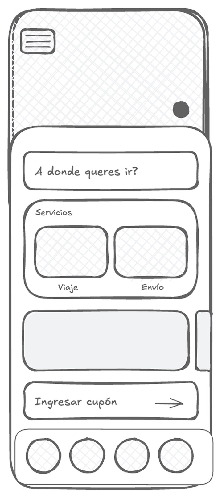
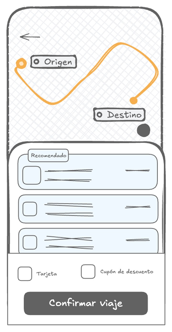
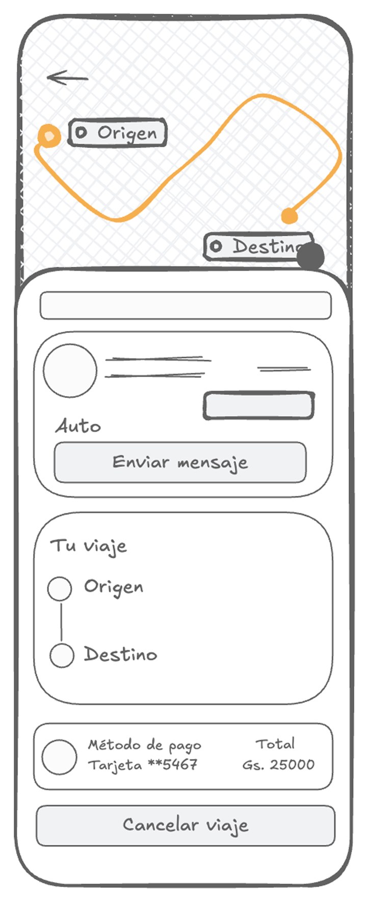
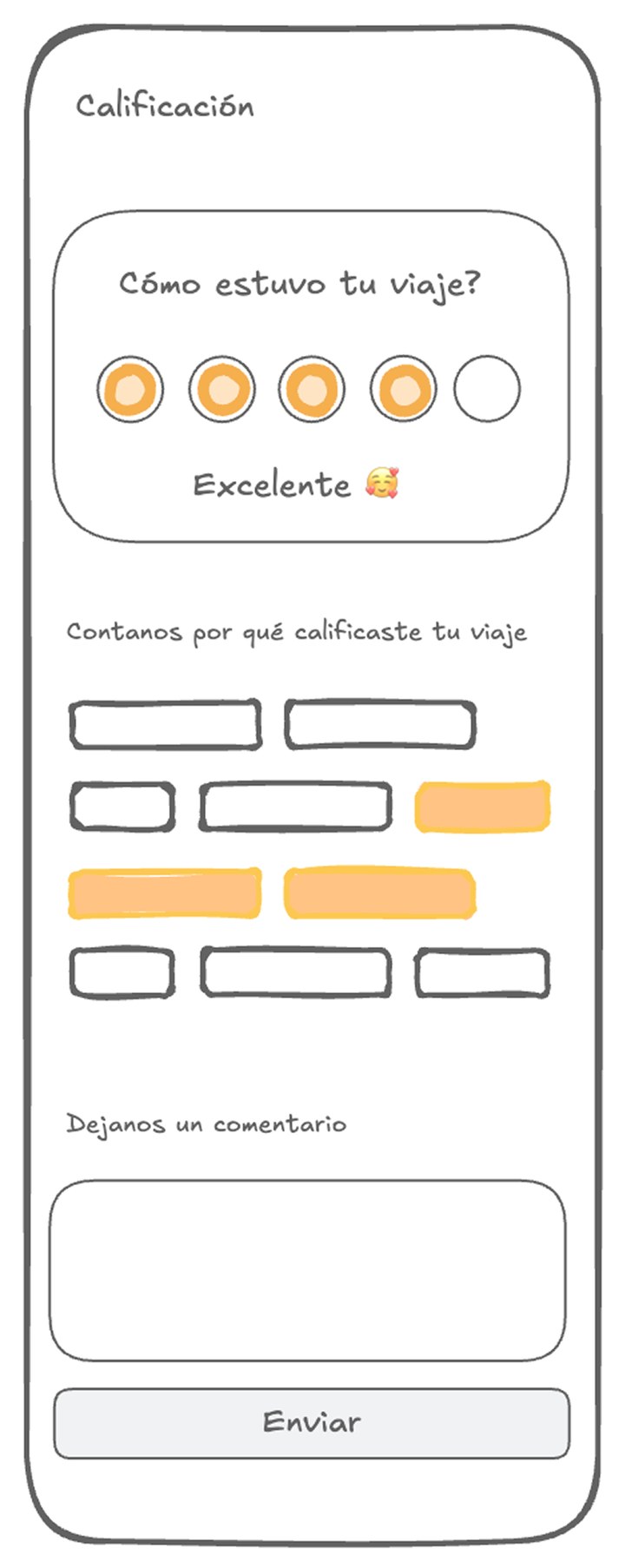
Low-fidelity, four key screens

Low-fidelity home: search field, Ride and Send services, a promotions carousel, a coupon entry and a four-item tab bar
Home
Low-fidelity trip screen: route with Origin and Destination, three category cards with the first marked Recommended, card and coupon options, and a Confirm trip button
Categories
Low-fidelity in-trip state: route on the map, driver card with a message button, trip summary from Origin to Destination, payment method and total, and a Cancel trip button
In trip
Low-fidelity review screen: five rating dots with Excellent selected, reason chips, a comment field and an Enviar button
Review

Home, trip category selection, in-trip driver state and review. Validating hierarchy and state transitions here caught edge cases before visual design.

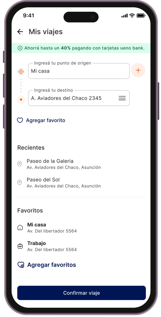
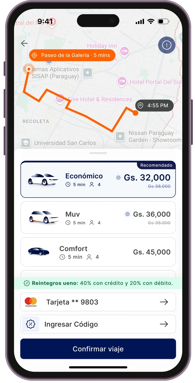
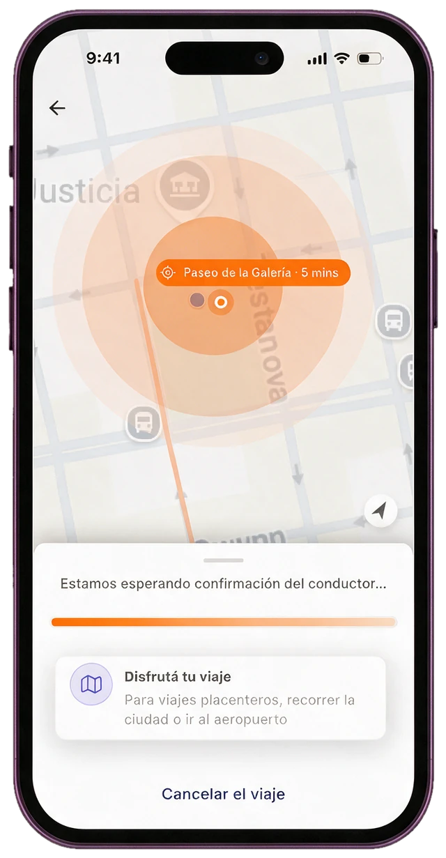
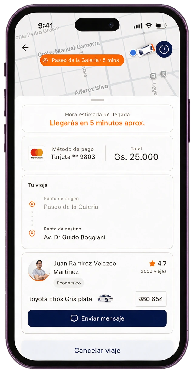
From destination to confirmation in four screens

Destination, categories, searching, confirmed. Every screen tells the passenger what the app is doing, so nothing feels stuck.

Destination screen titled My trips: the ueno bank savings banner, origin Home and destination fields, an Add favorite link, recent places, favorites and a Confirm trip button Enter your destination

Destination

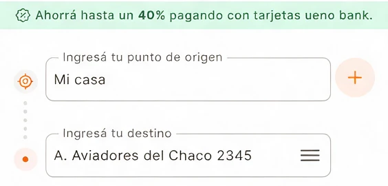
Origin and destination, with recents and favorites one tap away. The ueno rebate is already visible.

Category screen: route on the map, Economy marked Recommended, Muv and Comfort with time, seats and price, the ueno rebate line, card and coupon, and a Confirm trip button Confirm trip

Categories

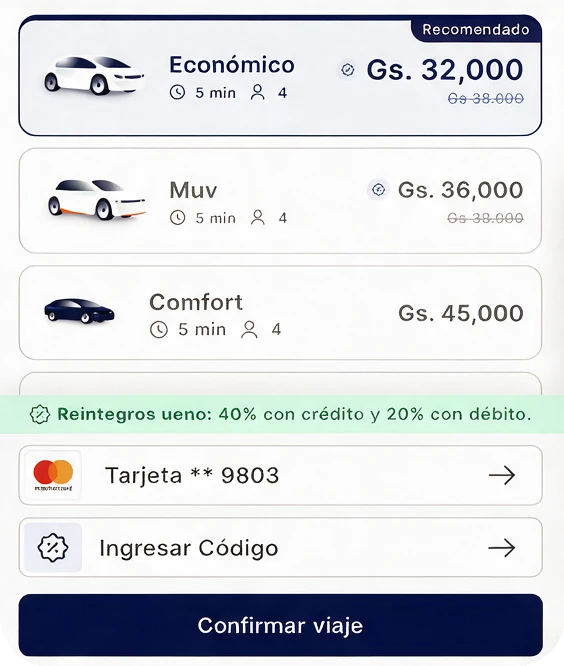
Economy, Muv and Comfort with time, seats and price. "Recommended" is preselected, and the rebate sits above the payment method.

Searching screen: concentric orange ripples around the pickup pin, the message We're waiting for the driver to confirm, a progress bar, a tip card and Cancel trip Waiting for confirmation

Searching

Ripples spread around the pickup while the driver decides. A card fills the wait, and cancelling stays one tap away.

Confirmed screen: estimated arrival Arriving in about 5 minutes, payment method and total, the trip from origin to destination, and the driver card with car, plate and a message button Arriving in 5 minutes

Driver confirmed

The ETA leads, then payment and the trip. The driver card shows who is coming, in which car, with the plate and one button to message.

The same flow, for sending a package

Send reuses the trip flow and its components: address entry, categories with a recommended option, and one clear action. Sending needs a card, so the home asks for one first. After the details step comes the delivery, and the same rating.

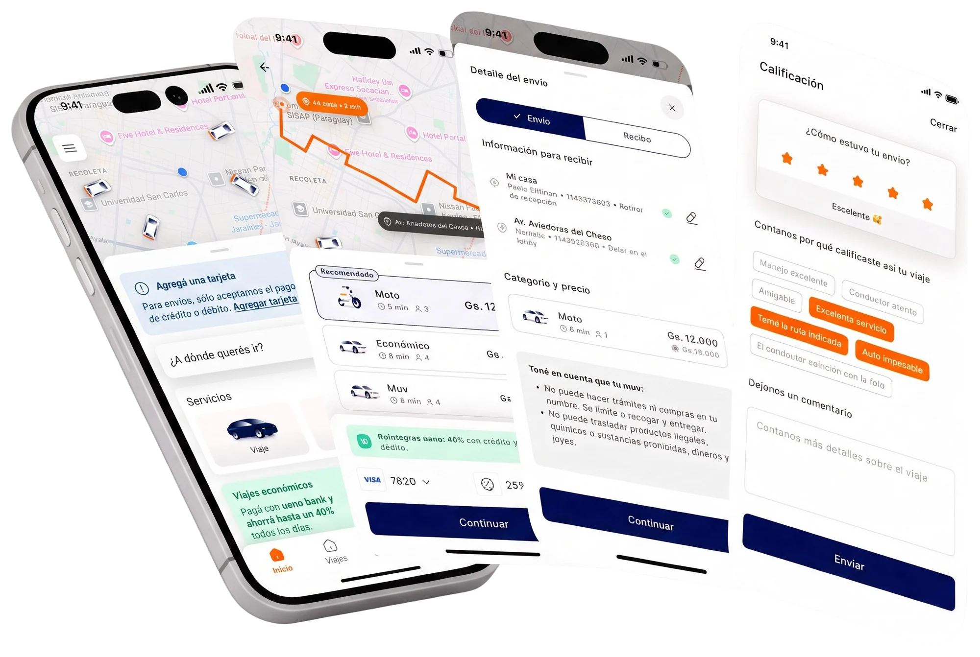
The Send flow in four screens, fanned out: the home asking to add a card above the Ride and Send services, the category list with Moto marked Recommended next to Economy and Muv, the package details with Send and Receive tabs and the price, and the rating screen with five stars and preset reasons
Send: add a card, pick a category (Moto, Economy or Muv), review the package details, and rate the delivery.

Motion that explains the wait

The wait is the most critical moment in a ride-hailing app, so movement here serves a single purpose: to answer the question before the passenger even asks it. Is it working? Where am I? What happens next?

We help users eliminate anxiety during the wait through subtle micro-interactions.

Searching for a driver

Five things move at once, and each one calms a different worry.

Map camera
The map travels between the pickup and the destination, so the passenger can see the app knows both ends of the trip.
Route trace
A highlight runs along the streets to the destination and back. The route is known, and the trip already feels alive.
Ripple at pickup
A soft pulse spreads out from the pickup point. We are searching around you.
Location ping
A ring breathes around the passenger's dot. This is you, and it's live.
Skeleton shimmer
Placeholders hold the shape of what is coming, so nothing jumps when the driver's details arrive.

Skeleton to categories

The sheet holds its shape while availability loads, then the real categories rise gently into place. Nothing jumps, so the passenger never loses their place.

Rating that adapts

Try it. The tags change with the score, every chip answers the tap right away, and the card leaves softly once the passenger is done.

RatingClose
How was your trip?
Not rated
Want to leave a comment?

Three decisions that shaped the product

Map first, one search field

The home is a live map with a single "Where do you want to go?" field. The two services, Ride and Send, sit in a sheet over it, and the sheet changes with what is happening: an active trip, a pending rating, or recent destinations. It came straight from the test: people think about a ride spatially.
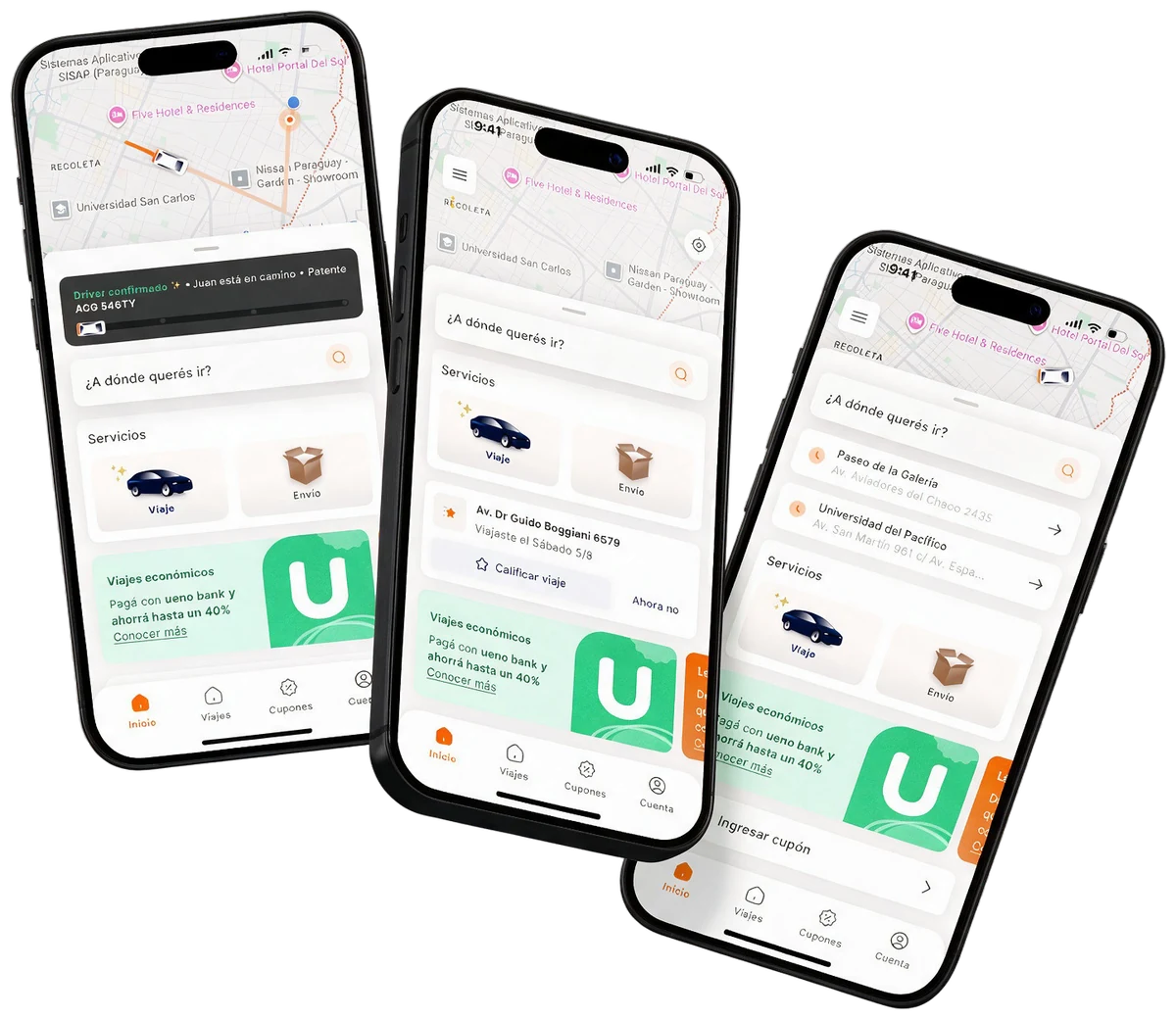

Three shipped home screens in different states: an active trip with the driver-confirmed banner, a pending rating prompt with Rate trip, and recent destinations, all with the search field, the Ride and Send services and the ueno bank promotion over a live map

Always say what's happening

60% of respondents didn't trust the cars the app showed, and accuracy wasn't something design could fix. So every wait has a name and an end: a skeleton while availability is calculated, "Waiting for confirmation", "Widening the search radius", and a five-minute free-cancellation countdown while the driver decides.

Animation of the searching state: the app widens the search radius while it looks for a driver

Recommend one category, show the reward where the decision happens

Preselecting "Recommended" (Economy) lets a passenger confirm in one tap, and steers demand towards the category the business wants to grow. The other categories stay in the same list.

Credit cards were the first payment method in the survey, so the ueno bank rebate (40% back with a credit card, 20% with debit) shows on the destination screen and again above the payment method, instead of on a separate promo screen.

Destination screen detail: origin and destination fields under a banner that reads Save up to 40% paying with ueno bank cards
On the destination screen
Categories screen detail: Economy marked Recommended, Muv and Comfort, the line ueno rebates: 40% with credit and 20% with debit above the card, the coupon row and the Confirm trip button
Again above the payment method

What testing told us

I ran six moderated sessions with the prototype, on two tasks: requesting a trip, and taking a trip with stops and rating it.

Results by task
TaskWhat workedWhat needs work
Request a trip

The search-bar request flow and the confirmation step.

The search animation and placing the pin by hand on the map.

Search should prioritise results near the user (Asunción), so trips don't resolve to addresses in other cities.

Trip with stops

The search animation.

People found the feature, but the logic confused them: where the stop goes, and an icon-only entry point. They preferred text over an icon alone.

Rating

Preset comments, emojis and three trip characteristics. The characteristics helped people give a better rating.

Ratings skew to 5 stars when the ride is fast and uninterrupted, and bad ones show up only after extreme experiences.

Continuing without writing a comment needs a clearer path.

See it move

The full passenger journey, screen by screen: from opening the app to rating the ride.

What changed

21 → 6

Steps in onboarding.

25% → 36%

Of people who started onboarding finished it: +11 percentage points.

Where the business aimed to be in 2026

These were the targets for 2026 when I worked on the app. They are estimates, not measured results: I'm no longer at the company, so I don't have the numbers after launch. The plan to get there had five levers, and the new passenger app was one of them.

Passengers
39KQ4 202581K2026 target
Trips
2.2M+Q4 20255.1M+2026 target
GMV
Gs 40.1BQ4 2025Gs 94.6B2026 target

Product and design

  • New passenger app, with UNID: one login across the ecosystem
  • Ueno Bank integrated as a payment method

Business and supply

  • Positive commission across Paraguay
  • Driver app stabilization
  • Automatic dynamic pricing

Design shaped the first two levers: onboarding and login, and how payment and rewards show up in the flow. The other three are business and supply work, and I'm not claiming them.

The funnel baseline the new app had to beat

Q4 2025, on the legacy app. I don't have these two numbers for the new app.

59%
Of registered passengers take a first trip.
52%
Of those who take a first trip are still riding by their fourth.

What I learned

State management is the design

Mapping every state before opening Figma saved weeks of rework and made the experience coherent from end to end.

Test the direction, not the detail

The map vs photo test wasn't about visual preference. It was about mental model, and that settled the whole home.

Visual QA in Dev Mode is collaboration

Annotating design against implementation in Figma Dev Mode turned QA from a confrontation into a shared task.

The system behind the screens

Navigation, services, the category card, payment and the driver card: built once, and reused across ride and send.

State-driven

Every component maps to a backend state, so there is no ambiguity between the UI and the system.

Information hierarchy

Driver, ETA and plate are always prominent. Payment and route are contextual.

Reusable by design

States are props on one component, not separate components.